How to Paint a Pallet sign with an Ombre Paint Technique
I love a GOOD ombre finish, one that blends nicely--and I think I came up with one that works great, especially on signs.
I am sharing with you a 2 color ombre paint technique. Ombre means shaded or gradual in tone or color. Most often you see it with one color and white added to make it gradually lighter. I used two complimentary, but different colors.
I started with a sign I put together from pallet wood.
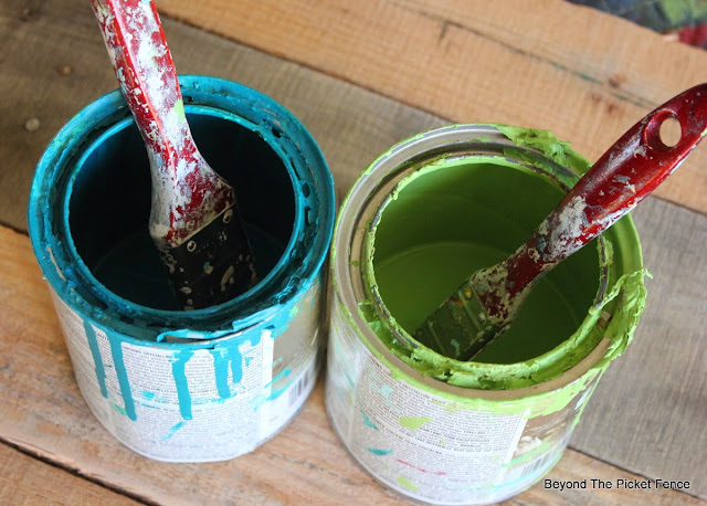
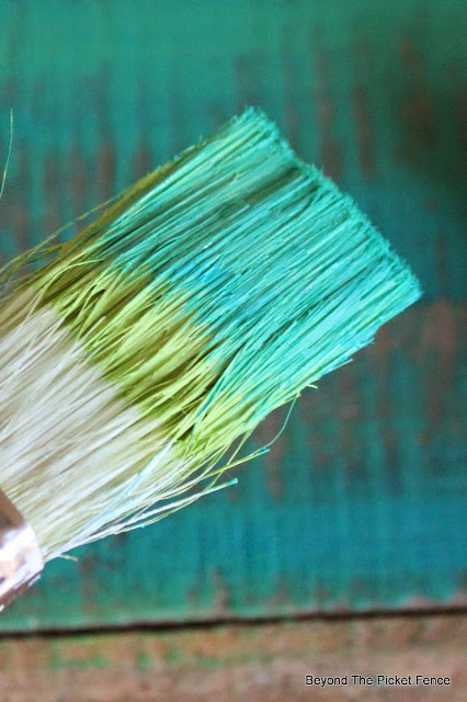
I decided the best way to do this was to double fist it. Yes, I know, living life on the wild side. I used a teal and a bright green color. Other colors that would work well together would be red and orange or yellow, blue and yellow, pink and yellow, navy blue and grey.
If you are a paint purist and can't handle a little green getting in your blue can and visa versa, pour some paint on a paper plate because you will get a little mixing.
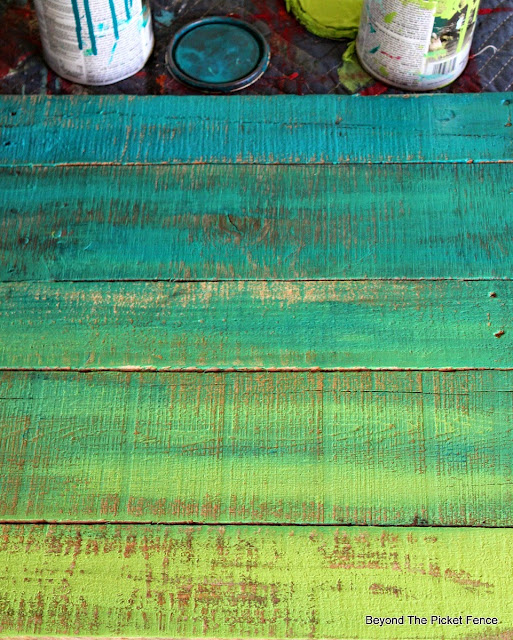
I started with the teal on one end and the bright green on the other. And then on the next board closest to the green I added a little teal first and then green on top. On the board next to the teal one I used a little green and then more teal on top.
The middle board got an even mixture of both colors. This is what it looked like when I was finished:
When it was dry, I gave it a light sanding and then used chalk to hand letter my sentiment.
I use white latex in a semi-gloss enamel. This helps the lettering to stay white and not get "dirty" when you stain over the paint. I use flat brushes for the block letters and a small brush for the never.
I applied Min-wax stain in Early American over all of it when the lettering was dry.
I love how the ombre turned out and how the white lettering pops against the bright colors.
See another great paint technique HERE.





Ooh! I love that green/blue combo - it makes me thing of spring! Great job, Becky. :o)
ReplyDeleteLove this. Thanks for the tips. Maybe you should challenge US to show our interpretation of your idea.
ReplyDeleteNow that's a GREAT idea!! So love it! ;)
DeleteThese signs are lovely, Becky!
ReplyDeleteLove the way you used 2 complementary colors instead of a color and white - great job!
ReplyDeleteOh I just LOVE this!!! It looks amazing!
ReplyDeleteI love, love love this. It's so simple, yet so beautiful. I think you meant to say the white
ReplyDelete"pops" against the other paint? Anyway, simply lovely. You are an artist through & through!
LOVE that ombre sign... just great!
ReplyDeleteBeautiful! I can't wait to try this and share your project. I always love your tutorials, you always make things seem so easy to do! ;)
ReplyDeleteVery pretty!!
ReplyDeleteThanks so much for stopping by!
Hugs,
Deb
Becky,
ReplyDeleteI love the Ombre effect on your pallet sign. Beautifully done!
Happy Creating,
Karen Marie
Great job! I love the colors and how the colors gradually change. It never crossed my mind to use chalk for my lettering, great tip. Won't have to break out the graphic paper as much. (-; Thanks for sharing!
ReplyDeleteLinda
I love this...simple and rustic! The colors are beautiful, just can't work them into our home :( I'd have to go with another combo. Enjoy it!
ReplyDeleteJP
Beautiful!!!!
ReplyDeleteOh my! Love what you have done with this pallet. Great color combo. Good job!
ReplyDeleteSteam carpet cleaning Ashford
Awesome!
ReplyDelete